
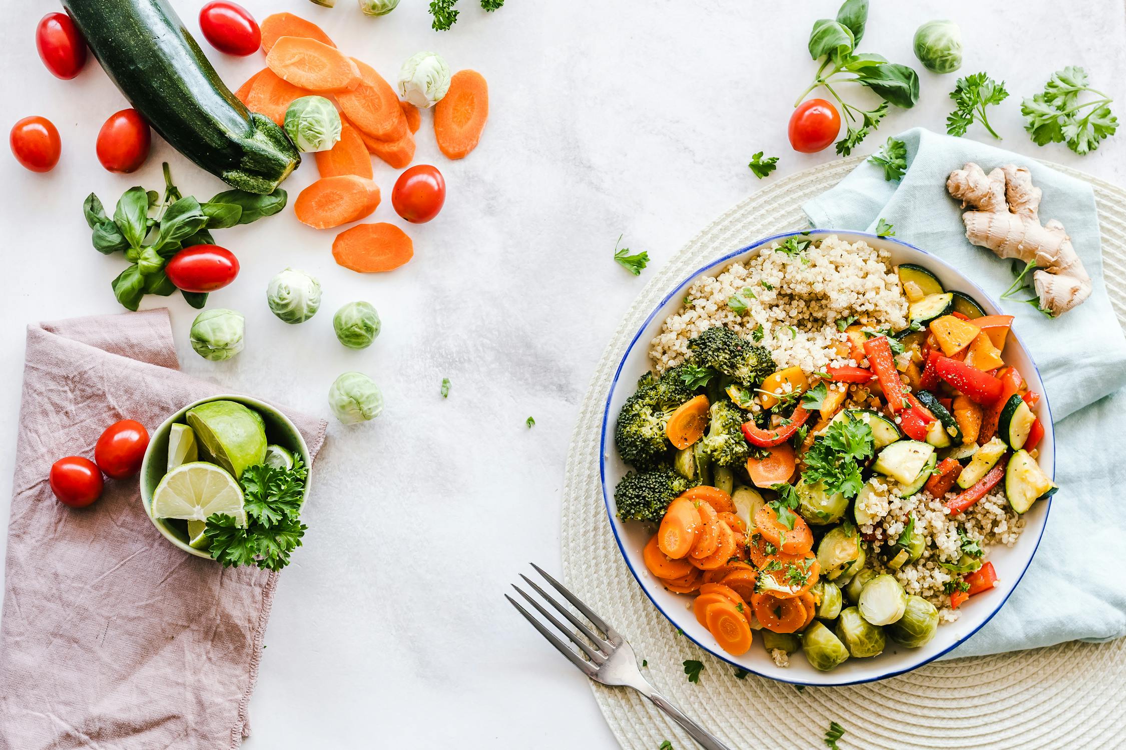
Chambal is a restaurant that blends traditional Indian flavors with a contemporary dining experience. They needed a website that matched their energy — warm, inviting, and effortlessly smooth. The goal was clear: a digital presence that makes you hungry before you even walk through the door.
Live: chambal.ashispace.in
End-to-end: UI/UX design in Figma, frontend development, performance optimization, and deployment.
I built the palette around warm earth tones — deep terracotta (#C45B28), rich cream (#FFF8F0), and charcoal (#2D2D2D) — to evoke the warmth of a kitchen without feeling heavy. For typography, I paired a modern serif (Playfair Display) for headings with a clean sans-serif (Inter) for body text. The contrast between the two creates visual hierarchy that guides the eye naturally from dish names to descriptions.
The menu section uses CSS Grid with auto-fit and minmax() to create a naturally responsive layout. Instead of fixed breakpoints, the grid reflows based on available space — meaning it looks perfect on a 320px phone, a 768px tablet held at the counter, or a 1440px desktop. No media queries needed for the menu grid itself.
Every section transitions with purpose. The hero features a full-bleed food photograph with a subtle CSS backdrop-filter: blur() overlay on the text region, ensuring readability without sacrificing the visual impact of the imagery.
The food gallery contains 20+ high-resolution images. Loading them all on page load would be brutal on mobile connections. I implemented native lazy loading with loading="lazy" on every image below the fold, combined with a custom Intersection Observer that triggers a subtle fade-in animation only when images enter the viewport.
Impact: Initial page weight dropped from ~4.2MB to ~800KB. First Contentful Paint improved by 62%.
The menu layout could have used a JavaScript masonry library like Masonry.js (~25KB gzipped). Instead, I used CSS Grid with grid-template-rows: masonry (with a flexbox fallback for browsers that don’t support it yet). This eliminated a JavaScript dependency entirely.
Impact: Zero layout shift from JS-calculated positions. The menu renders in a single paint cycle.
Every dish is wrapped in an <article> element. The menu categories use <section> with proper <h2> headings. The navigation is a <nav> with an aria-label="Main navigation". The reservation form uses <fieldset> and <legend> for screen reader context.
Impact: The site scores 100 on Lighthouse Accessibility. Search engines can parse the menu structure as structured content, improving local SEO for “restaurant near me” queries.
Both Playfair Display and Inter are loaded with <link rel="preload" as="font" crossorigin> in the document head, with font-display: swap to prevent Flash of Invisible Text (FOIT).
Impact: Text is visible within 100ms of page load, even on slow 3G connections. No layout shift from font swapping.
Every food photograph uses the <img srcset> attribute with three resolution variants (400w, 800w, 1200w) and a sizes attribute that matches the CSS layout. The browser picks the smallest sufficient image for the user’s device.
Impact: Mobile users download images that are ~40% smaller than desktop variants, saving bandwidth and improving load times on cellular connections.
The entire color system runs through CSS custom properties (--primary, --surface, --text). This made it trivial to implement a warmer evening-mode color scheme triggered by a simple class toggle on <html>.
Impact: Theme switching happens in a single repaint — no JavaScript recalculation of styles, no FOUC.
Building Chambal taught me that restaurant websites are secretly performance-critical applications. People browse menus on their phones at the restaurant, often on spotty WiFi. Every kilobyte matters. Every millisecond of layout shift is a potential bounce.
The biggest lesson: the best frontend decision is often the one where you don’t add a library. CSS Grid replaced Masonry.js. Native lazy loading replaced lazysizes.js. The result was a faster, lighter, more maintainable codebase.
